
Choosing the right paint colors for interior rooms can transform your living space, making it feel more cohesive, inviting, and reflective of your personal style. Whether you’re redecorating a single room or giving your entire home a facelift, understanding the principles of color selection can help you create a space you’ll love. Here’s a comprehensive guide to help you pick the perfect paint colors for your interior rooms.
How To Choose Interior Paint Colors
1. Create a Color Scheme That Matches Your Home’s Furniture
Start by taking a close look at the furniture and decor in your home. Your paint colors should complement your existing furnishings rather than compete with them. Consider the dominant colors in your furniture, artwork, rugs, and other decor items. For a cohesive look, choose paint colors that harmonize with these elements. You can create a balanced color scheme by selecting a primary color and then adding one or two accent colors.
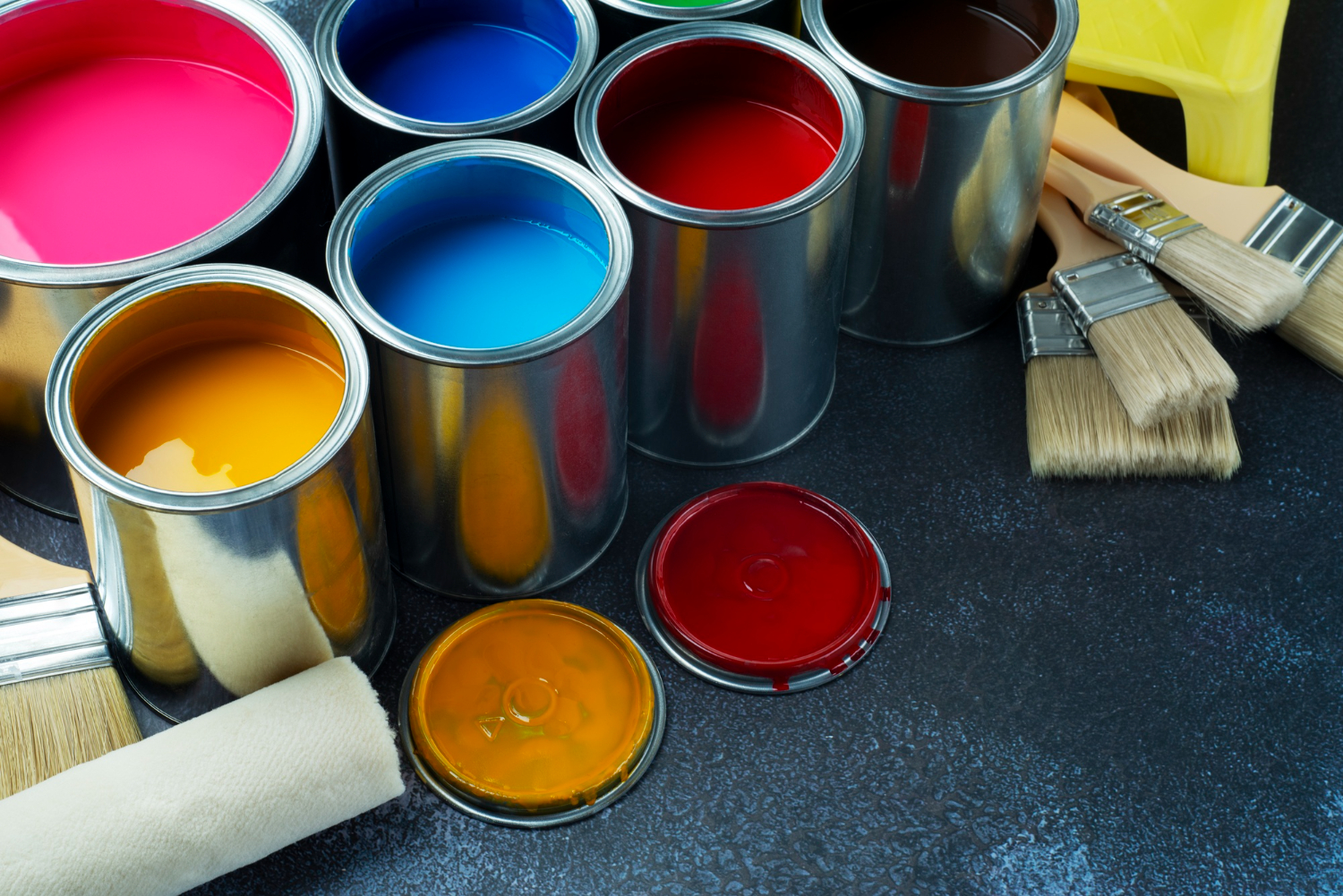
2. Decide on the Finish to Create an Appealing Visual Effect
The finish of your paint can significantly impact the overall look and feel of a room. Different finishes can create different visual effects:
Matte:
Great for hiding imperfections on walls, providing a smooth and elegant look.
Eggshell:
Slightly reflective, making it ideal for areas that need durability but still want a soft appearance.
Satin:
Offers a subtle sheen and is easy to clean, perfect for high-traffic areas.
Semi-gloss:
Reflective and durable, best for trim and doors.
Gloss:
Very shiny and reflective, used for highlighting architectural details.
Choose the finish that best suits the function and style of your room.
3. Match The Color To The Feeling You Want In The Room
Colors have the power to evoke emotions and set the tone of a room. Think about the mood you want to create:
Warm colors (reds, oranges, yellows):
Energizing and inviting, perfect for living rooms and kitchens.
Cool colors (blues, greens, purples):
Calming and relaxing, ideal for bedrooms and bathrooms.
Neutral colors (whites, grays, beiges):
Versatile and timeless, great for any room.
Consider how each color makes you feel and choose accordingly to create the desired ambiance.
4. Know Your Whites
Not all whites are created equal. There are warm whites, cool whites, and neutral whites, each with its own undertone. Warm whites have yellow or red undertones and can create a cozy atmosphere. Cool whites have blue or green undertones and can make a space feel fresh and modern. Neutral whites are balanced and versatile, working well in any setting. Test different shades of white in your space to see how they interact with your lighting and furnishings.
How To Use Interior Paint Colors
5. Create Flow in Open Plan Spaces
In open-plan spaces, it’s essential to create a sense of flow and continuity. Use a consistent color palette throughout the space to unify different areas. You can use varying shades of the same color to define different zones while maintaining a cohesive look. For example, a soft gray in the living area can transition to a slightly darker gray in the dining area.
6. Make Small Spaces Feel Bigger or Cozier
What Colors Make A Room Look Bigger?
Light colors can make a room feel larger and more open. Opt for whites, light grays, or pastels to create an airy and spacious feel. These colors reflect more light, making the room appear brighter and bigger.
What Colors Make A Room Cozier?
Darker, warmer colors can make a small room feel cozy and intimate. Deep blues, rich greens, and warm browns can add depth and a sense of comfort to a space. Use these colors sparingly to avoid overwhelming the room.
No-Fail Paint Colors for Small Spaces
Light Gray:
Neutral and versatile, it can open up a room while providing a sophisticated backdrop.
Soft Blue:
Calming and serene, it adds a touch of color without overwhelming the space.
Warm Beige:
Cozy and inviting, it adds warmth without making the room feel small.
7. Using Color Architecturally
Painting Molding and Doorways
Highlight architectural details like molding and doorways by painting them in a contrasting color. This can add depth and interest to your space. For a classic look, use a crisp white on molding and trim with a bold wall color.
Where Do You Switch Color When Moving From Door to Casing?
When changing colors from one room to another, make the transition at the door frame. Paint the door and its casing the same color as the room it opens into. This creates a seamless flow and prevents abrupt color changes.
8. Exploring Using Two Different Colors in The Same Room
Using two different colors in the same room can create a dynamic and visually interesting space. Consider painting an accent wall a different color or using a two-tone effect with a chair rail. Choose colors that complement each other and enhance the room’s overall aesthetic.
9. Create Contrast in Rooms with Wainscoting
Wainscoting provides an excellent opportunity to play with contrast. Paint the upper part of the wall a different color from the wainscoting to add depth and interest. This technique works well in dining rooms, bathrooms, and hallways.
10. Create An Accent Wall to Add a Focal Point
An accent wall can add a striking focal point to any room. Choose a bold color that stands out from the rest of the walls but still complements the overall color scheme. Accent walls work particularly well behind a bed, sofa, or fireplace.
11. Explore Bolder Options with Multiple Colors
Don’t be afraid to experiment with bolder color combinations. Use a color wheel to find complementary colors or analogous colors that work well together. Bold color schemes can create a vibrant and lively atmosphere.
12. Treat Your Ceiling Like a Fifth Wall
The ceiling is often overlooked, but it can significantly impact the room’s overall look. Consider painting the ceiling a color other than white to add depth and interest. Light colors can make the ceiling feel higher, while darker colors can create a cozy, intimate atmosphere.
5 Paint Color Selection Mistakes To Avoid
1. Being Afraid To Explore Interior Paint Color Options
One common mistake is playing it too safe with color choices. While neutrals are timeless, don’t be afraid to explore bolder options that reflect your personality and style. Test samples on your walls to see how different colors look in your space.
2. Putting Too Much Paint On The Walls
Too much color can overwhelm a space, making it feel chaotic and cluttered. Balance bold colors with neutral tones to create a harmonious look. Consider using bold colors as accents rather than painting all four walls.
3. Putting Too Little Paint On The Walls
On the other hand, too little color can make a room feel bland and uninspired. Don’t shy away from using color to add personality and warmth to your space. Even a subtle color can make a significant difference.
By following these guidelines and avoiding common mistakes, you can confidently choose paint colors that will enhance the beauty and comfort of your home.